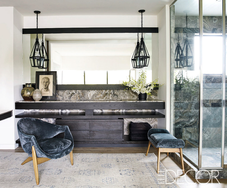
I saw this image today. My first thought was of the peaceful and calm nature of this bathroom's design. I love everything about it: how the quiet elements allow for a backsplash with so much movement in the stone. How the lanterns are hung off-enter of the sinks so that the user doesn't konk his or her head on them, its overall symmetry without looking staged. But the more I looked, and admired, the more I noticed the challenges to its functionality. This image is shown as an isolated room and without seeing the space in its entirely, I cant really comment on its utility. Also, photographers are notorious for moving things around the for the sake of "the shot". But I do see the use of silk velvet in a room with moisture. I notice sinks and a dressing area, but no mirrors. I see windows allowing for a tremendous amount of natural light, but no means to filter or block that light and its corresponding heat. And the lanterns, while beautifully dramatic, won't throw the cone of light needed to illuminate the counter area and I don't see any ceiling cans to augment. My point isn't to dissect this room. Im so impressed by its aesthetic that it I looked at it long enough to notice these possible shortcomings. My intention is simply to remind: form follows function. Its my motto and the core of every design project I undertake. How is the space to be used? What is that function? Define it and then keep it front of mind so that the end result is a pleasing space that meets that requirement perfectly. That's really the heart of good design.

